Help Me Choose Images
I just got an email from IStockPhoto telling me I have a couple of credits which are about to expire. I don't know about you, but I hate to waste money I've already spent, so I thought I'd pick up an image or two for future use.
I'm currently working on the second book in my Phoenix, Ltd. bodyguard series, tentatively entitled BOILING POINT. I've thrown together several possible combinations of images that I think might work for the cover and would appreciate your opinion. Since this will be the second in a series, some continuity might not be a bad idea. Here's the cover of UNWRITTEN RULES (Book 1) to refresh your memory.
I'm considering three background images: a Chicago cityscape, smoke on black, and steam on blue. The cityscape relates to the background of UNWRITTEN RULES, but the other two express the BOILING POINT title (this heroine goes undercover as a personal chef). Both figure images features legs like UNWRITTEN RULES, but one is more prominent. The other is wearing a red dress, also a tie-in with UNWRITTEN RULES. The title will be in the same font, but could be red or white.
 |
| #1 |
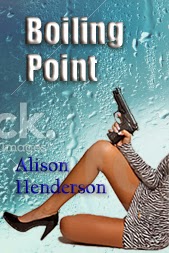 |
| #2 |
 |
| #3 |
 |
| #4 |
 |
| #5 |
 |
| #6 |
Please let me know which elements you think make the most striking cover, individually and/or together. Also, please feel free to tell me to keep looking. I really appreciate your input!

I like #1, both because it echoes the first cover the most closely, but also because I found the water droplets on #2 distracting. Hope that helps! Great covers, all of them!
ReplyDeleteEllen, the composition in #1 strikes the best balance. I just worry a little that it doesn't tie in enough with the original book in the series.
DeleteI guess I like #5 best since it keeps the theme from the first cover. I like #1 second. I like just the legs, and the smoke is cool.
ReplyDeleteAnother vote for #5!
DeleteI like # 5 best with number 4 a close second. I like the title in red for sure. I think the continuity aspect of having the city-scape in the background ties the books together nicely.
ReplyDeleteRoz, everyone seems to like #5, and I'm definitely going with the red title!
DeleteI like #3 and #4 because you keep with the red. The background I can't say because I don't know which goes with the story best. I didn't care for the same leg look as book one but rather liked the same red dress. Good luck!
ReplyDeleteJody, #3 is a study in black, white, and red. Pretty striking.
DeleteI like #3 the best but I think #5 offers the best follow up to book #1. I love that red dress but the city scape & the legs = great continuity.
ReplyDeleteSusan, I think #3 is quite strong graphically, but I am concerned about the continuity aspect.
DeleteThanks so much, everyone! My favorites so far are #1, #3, and #5. They each have pluses in terms of visual punch and continuity for the series.
ReplyDeleteI would definitely go with the city background just because it mirrors the first book so well. Have you tried the red girl on the city background? I actually think that would be my favorite combo. Also, I can make a decision about my Serendipity cover (I'm waffling again on the image) if that would help with your credits.
ReplyDeleteJannine, I had tried the red girl on the city background, but she was too small when I included the whole figure. I cropped it a bit more and added it as #6. I think you've hit on the perfect combination. What do you think?
DeleteLove it! Looks perfect!
DeleteI like #4
ReplyDeleteThanks, Melissa. I'm glad someone likes the steam background. I thought it tied in well with the title.
DeleteI really, really like #1, but since this is part of a series the city background does tie one in with the other.
ReplyDeleteVonnie, #1 was the first I made, and I love it, too. It might not tie in as well to the series theme, but it's SMOKIN', literally!
DeleteGotta be different, I guess--I like #2 with #5 as a close second. I do like the splash of red, but don't like the leg shot as well on the girl in the red dress.
ReplyDeleteLiz, I like the girl in the zebra print, too. And I like the angle of the gun - it points to the title.
DeleteLate getting here. Sorry. Guess I'm in the minority too because, on its own, I like #2 the best. Now with the city tie in, I would have to go with #5. I like that pose the best. Definitely red for the title though.
ReplyDeleteMargo, I think for the reasons you mentioned I'll basically go with #5 or some variation. I might choose a different skyline view, but that model and the red title really work for me. Thanks!
DeleteI like #2 - because the font is clearer.
ReplyDeleteThanks, Nan. I really haven't worked on the fonts yet. I've been concentrating on the images. I definitely want a nice, clear font!
DeleteI like #2 for lots of reasons, but mainly it just draws me in more than the others.
ReplyDeleteThanks, Christine. I think I'm going to go with a modified version of #2.
DeleteIt's #2 for me, too, but maybe with a red title. I like the way the figure is holding the gun for the thing. She's in charge. To me the city behind the figure seems busy. You want the cover to pop. #2 draws is clean, draws my attention and says, Contemporary suspense, woman on top. I'm sold!
ReplyDeleteKathy, I tried #2 with a red title and different font for the author name, and I loved it!
DeleteNumber 5, with number 1 a close second.
ReplyDeleteThose are both really strong images, Sandra. Thanks for the input!
Delete